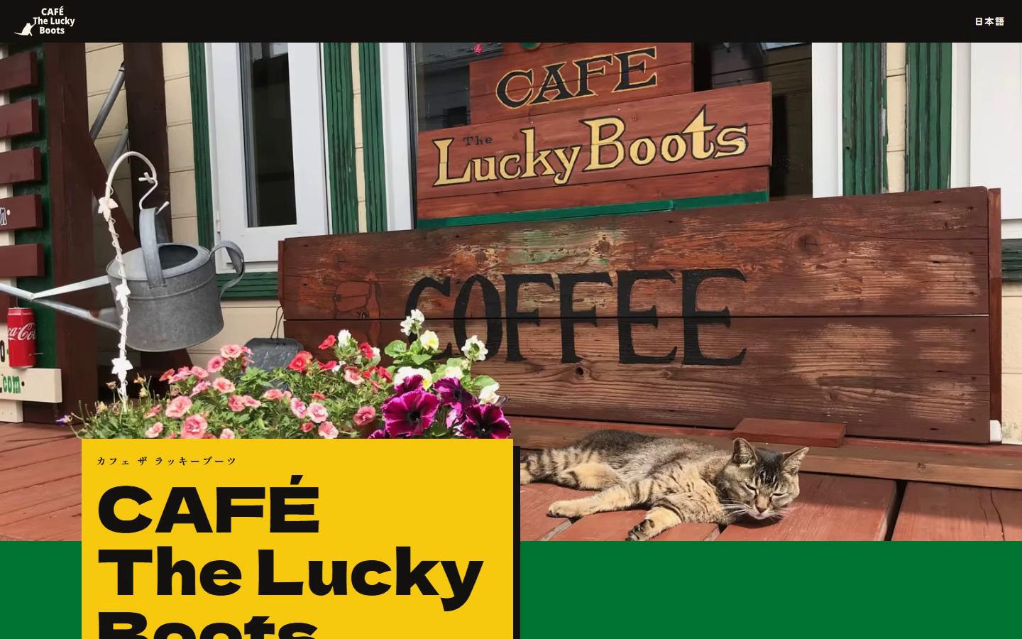
Cafe The Lucky Boots n., a café cut open
A café that rents rooms by the hour, drawn as a building you can tap open.
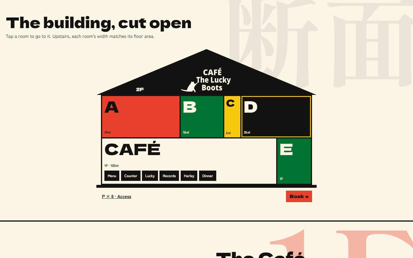
The site is in Japanese and English, with the same four pages in each. Its home page is a cross-section of the café: every room is a link to its photographs, its hourly rate and how to book it.
- My part
- Design and build
- For
- Café guests and room renters
- Live site
- Open the site
The problem
what the café needed
The café takes reservations over the phone and hires its space by the hour: the 100 m² ground floor, or one of the four rooms upstairs at 29, 16, 6 and 26 square metres. A guest arriving in Japanese or in English has to see what a room costs, how many people it holds and what it looks like, then find the number to call.
Constraints
what the site had to work within
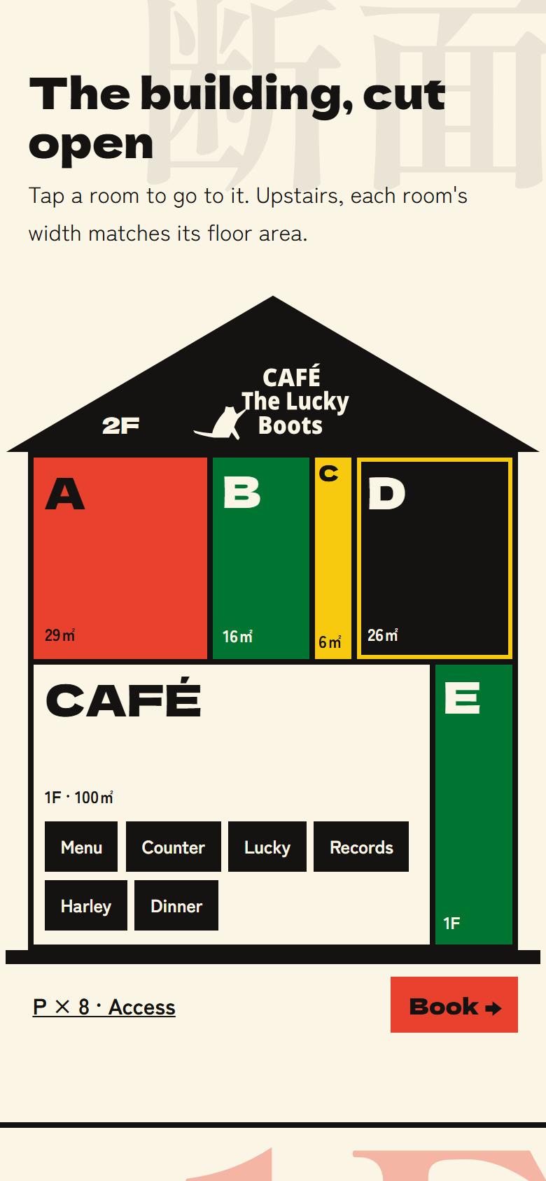
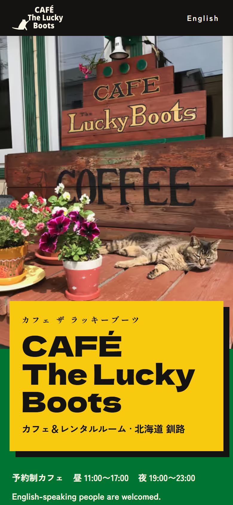
Japanese is the default, so the bare address opens the Japanese home page, and a switch in the top bar carries a visitor to the same page in the other language. The upstairs rooms keep their real proportions, down to the smallest screen, where the smallest room is a sliver. Booking stays a phone call, so the number sits on a panel of its own inside the drawing.
What I built
the decisions, in order
The building is the navigation
The home page is a cross-section of the café, and every part of it is a link: the rooms upstairs, the café, the menu, the counter, Lucky, the records, the Harley, access and booking. Three directions were drawn in full before this one won on being the easiest to use.
Rooms drawn at their floor area
An upstairs room’s width on screen is its share of the floor area, on a phone as on a wide screen, so the 6 m² room stays a sliver of the 77 m² upstairs. Each room shrinks with its share, and the Japanese room labels run vertically so the narrowest room still holds one.
See Plate II.
One set of facts, two typed copies
Rooms, prices, hours and contact details live once, in a module with no language in it. The Japanese and English copy are two files typed against a single shape, so an English line left unwritten fails the type check instead of reaching a page. Where the café’s current site and the older data disagreed, the café’s site won.
See Plate III.
Booking is a phone call
The Booking panel carries a tap-to-call number, the hours to call, email and map links and the reservation rules.